Formatting Your Value and Category Axis
Now that you have your data the way you want it, you can start making your graph a bit more pretty.
Select your graph by clicking on it with the Selection tool, go to Object menu, scroll down to Graph and in the drop-down menu that appears, select Type...:
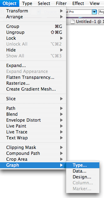
This will open the Graph Type Window dialog box:
There are quite a few formatting options here. Unfortunately, you have to click OK to see your changes and then Undo if you don't like what you see.
In addition, each time you click OK, the Graph Type Window disappears so to make it reappear, you have to go back to the Object menu, scroll down to Graph and in the drop-down menu that appears, select Type. However, the quicker way to bring back the Graph Type Window is by double-clicking on the Line Graph Tool (or whatever graph type tool is currently showing) on the toolbar. In both instances, your graph must first be selected using the Selection tool. This is very important: if your graph isn't selected when you try to edit it by bringing up the Graph Type Window (or the Data Window), Illustrator will try to create a new graph.
When it comes to formatting, it is also important to recognize that your graph is a Grouped object. If you Ungroup it, you will lose the ability to edit data in the Data Window. You can, however, format it using the Direct Selection and Group Selection tools. More on that later.
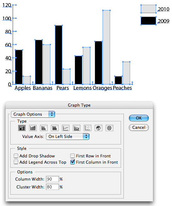
Back to the Graph Type Window dialog box. Here, with a simple click, you can change your graph style to any one of Illustrator's nine graph types. Using the Product.txt data, here is what the the line graph would look like if you switched it to the bar graph (note, that you have to click OK to see your new graph style). Notice that the Options choices in the Graph Type Window also change for each graph style:
If you switched your graph type, click Undo (under the Edit menu) to return to the Line Graph we've been working on, Select the graph if it is not already selected and then double-click on the Line Graph tool on the toolbar to bring back the Graph Type Window:
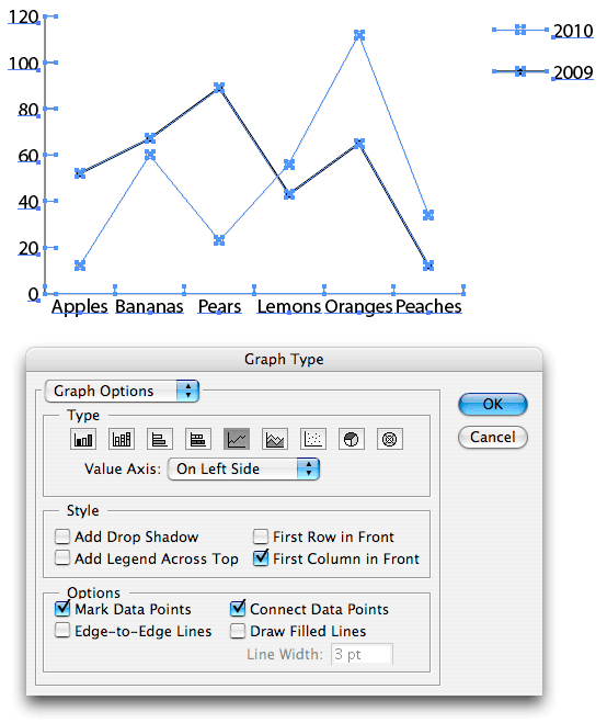
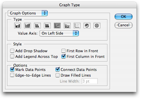
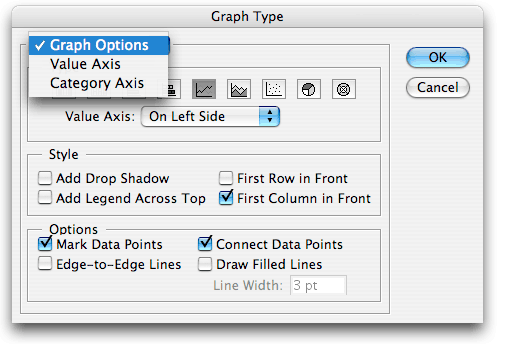
For our Line Graph, when you click on Graph Options in the top left corner of the Graph Type Window, a drop-down menu appears where you can edit your graph's Value Axis and Category Axis:
Select Value Axis and the dialog box will change (see below). Values on the Value Axis are those values along the side of your chart (in our Line Graph, they are the O, 20, 40... values on the Y-axis):
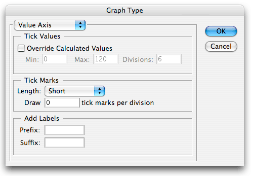
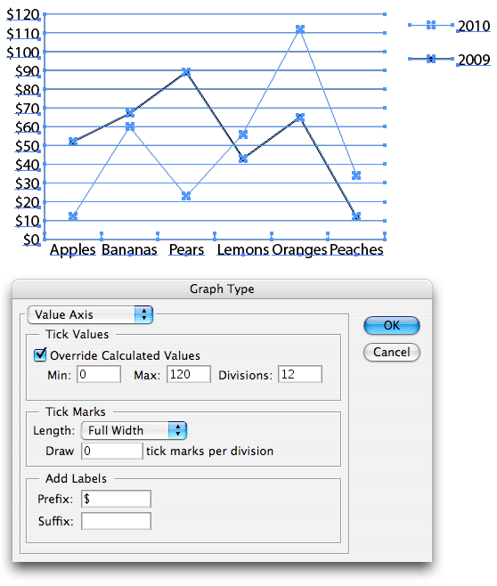
Tick Values: Ticks are those little slashes next to the 0, 20, 40... values along the Value Axis. Click on Override Calculated Values to change the default tick values. Min. is the minimum value that will go at the bottom of the axis, Max. is the maximum value at the top of the axis and Divisions is the number of ticks. So if we want the values along the side of the graph to show up in divisions of 10 instead of 20, set the Min. to 0, the Max. to 120 and Divisions to 12 (see below). At the end of this page, however, check out the box for what I call the "2147483 Value Limit Bug".
Tick Marks: Here you can change the length of your ticks (I changed them to Full Width, see below), and the number of ticks per division.
Add Labels: Here you can add a word or symbol Prefix (before) or Suffix (after) your values. (I added a "$" Prefix before each value, see below),
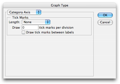
Remember that you have to click OK to see any changes in your graph. Double-click on the Line Graph tool on the toolbar again to bring back the Graph Type Window. Under Graph Options, scroll down to Category Axis. This is where you can specify tick length and frequency for values along the bottom of your line graph. You can also choose to have no ticks whatsoever, which is what I have done here:
We want to leave the default settings so click OK. Double-click on the Line Graph tool on the toolbar again to bring back the Graph Type Window. There are several other options of interest:
- Value Axis: Here you can actually change the placement of the values that are currently running along the left side of your chart. You can move them to the right side or put them on both sides.
- Style: Here you can add a drop shadow (better for bar charts), move the legend from it's current position on the right side to the top of the chart, and determine which columns or rows will be displayed in the front (again, of interest when creating bar charts).
- Options: These options are specific to the line graph style and will change for each graph style. Line graph options include Mark Data to Points (give you that nice square box at each data point, Edge-to-Edge Lines (draws lines that extend all the way across the graph from left to right), Connect Data Points (draw lines between data points), Draw Filled Lines (creates a wider line—whatever is specified in the Line Width):
| The 2147483 Value Limit Bug This had me banging my head for quite some time. I was working with two columns of numbers that valued in the millions. However, whenever I tried to change the Max value in the Value Axis portion of the Graph Type dialog box: 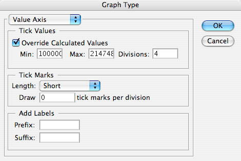
I got this error message: 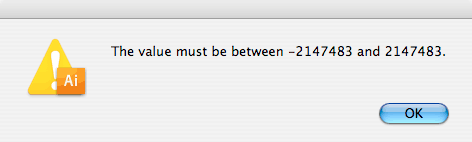
As it turns out, when dealing with data values that are 7 digits or more, you always get this error message when you try to Override Calculated Values. You're not crazy. It's a bug. One that has no fix. You have to just accept the default Min, Max and number of Divisions or edit your data to make your number values smaller. Pfft. |
Next: PART III: Formatting with the Group Selection Tool