When creating a project (whether it be an entire book or a simple newsletter) and sending it to a commercial printer or service bureau, you'll save yourself some hassle if you adhere to a few simple guidelines.
GENERAL RULES
DO create and edit your text in a word processing application such as Microsoft Word and then import the text to a desktop publishing application such as QuarkXPress or InDesign where you can create your page layout, format the text with graphics, etc.
DON'T use Microsoft Word as a desktop publishing application. Word does have many of the same layout features as desktop publishing apps such as Quark and InDesign (i.e., it can create columns, import graphics, create nice laser prints, etc.) but when it comes to commercial printing, Word is not going to get you very far. Microsoft Word, WordPerfect, etc. are word processing applications, NOT desktop publishing/layout programs. They handle font replacement differently and often cause reflow.
DON'T create your page layout for multi-page documents in draw programs such as Illustrator. Use desktop publishing apps like Quark or InDesign.
DO provide the printer with a hard copy laser printout of your project, as well as all of your layout files (in Quark, InDesign, etc.), graphics and fonts. Inkjet printers are fine for initial proofing and printing, but always get a final printout (and proof it) from a PostScript laser printer.
DON'T assume that what you have printed out and submitted as hard copy or see on your monitor is what you will get. Take a good long look at proofs and bluelines supplied by the printer.
DO take your printer's advice.
DON'T assume that you know more than the printer.
FONTS
DO supply the printer with ALL of the fonts used to create your project (even the symbol, fraction and dingbat fonts). Try not to use TrueType fonts, and for PostScript fonts, make sure you supply the printer with both the screen and the printer font parts. Remember to include fonts used to create EPS graphics, and fonts that the printer probably already has (i.e. like Helvetica, etc.). There are many different versions of some fonts and a “wrong” version can cause reflow/repagination problems.
DON'T use Bold or Italic in the style menu or hit the Bold or Italic button when you want to bold or italicize text in your page layout program. Use the actual font. For example, in Quark, if you want to create text that is Helvetica Bold, don't select some Helvetica text and then bold it. Instead, select the text and change the font itself (not the style) from Helvetica to Helvetica Bold:
DO: | 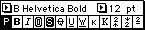 |
DON'T: | 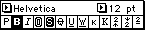 |
DON'T use TrueType fonts. Period. Always use PostScript or OpenType and Adobe fonts (Macintosh or PC/ Windows) are always a safe bet. TrueType is fine for printing to a laser or inkjet printer, but TrueType fonts can cause severe problems when it comes to commercial printing. Many commercial printers won't even print a project that contains TrueType fonts. Often, they pop.
DON'T use 20 different fonts for a 4-page newsletter. It makes you look like you don't know what you're doing. In desktop publishing, consistency is everything. Use one font for your main body text, another for your main heads, another for photo captions, another for sidebars, etc., but don't mix and match fonts for your main body text or make every headline a different font unless you're trying to create some sort of chaotic effect and it is your intention to confuse the reader. Too many fonts is not only considered to be bad design, but it also slows printing to a crawl.
GRAPHICS
DO supply ALL of the graphics used to create your project. Desktop publishing applications like Quark and InDesign link to your graphics; they do not embed them in the document. If you don't supply the graphics along with your Quark or InDesign documents, the printer will get a missing picture error, and won't be able to continue until you supply the graphics.
DO use TIFF and EPS graphic file formats:
- Use TIFF or .psd for halftones: graphics that are not just black and white, but rather, have many shades of gray or color gradation (i.e. scanned photos that were created or edited in Photoshop or an image editing application). For information on resolution, see the tutorial on halftoning tips.
- B&W clip art (no shades of gray—just 100% black and 100% white) looks best if scanned in and saved in 1200 dpi Bitmap TIFF format.
- Use EPS or .ai for line art, illustrations, charts, clipart, etc.—graphics that are basically black and white and were created or edited in vector applications such as Illustrator or Freehand. Resolution should be at least 600 dpi, 1200 dpi is the standard and creates the best print quality.
DON'T use other graphic file formats like JPEG and GIF. Just because you can import them into your desktop publishing application doesn't mean that you should. Stick with TIFF, .psd, .ai and EPS. If your graphics are in any other format, convert them.
DO most, if not all, of your image editing and graphic manipulation (i.e. lightening, darkening, etc.) in the original program that the graphic was first created or edited in, rather than the desktop publishing application. For instance, if a Photoshop TIFF needs to be lightened or darkened, lighten or darken it in Photoshop, not in Quark. Even though Quark will lighten or darken an image, adjust contrast, etc., you may get different results once you project goes to press and is printed.
DO name your graphics with the appropriate file extension: filename.tif, filename.eps.
DON'T rename graphics once you have placed them in your desktop publishing/page layout document(s). If you do, make sure to go back into your document and re-link the graphics.
DO check your mode for color TIFFs and .psds. Save color TIFFs and .psds as CMYK (not RGB, never RGB). Save black & white TIFFs and .psds as Grayscale.
DO check with your printer to see if they charge extra for breaking any of these “rules.”
DESIGN & PAGE LAYOUT
DO use a document setup size (i.e. your page dimensions) that is the same as your trim size. For instance, if you are creating a 6 by 9-inch book, set up your initial page size in the document setup for 6 by 9-inches.
DON'T create 6 by 9-inch text frames in a 81/2 by 11-inch document setup and manually add registration marks.
DO make page elements that bleed extend at least 1/8th of an inch beyond the page boundary.
DON'T use your page layout/desktop publishing program's predetermined “hairline” rule. The width varies from program to program, and prints out differently on a laser printer than on an imagesetter, if it prints at all. Don't create rules that are less than .25 pt.
DO watch for widows, orphans, rivers, bad kerning and other desktop publishing no-nos that will make you look like an amateur. Get rid of double-spaces after periods, don't use spaces to align columns (use tabs) or to create paragraph indents. Know your en dash (–) from your em dash (—).